분류모델 생성 및 시각화
프로젝트명 : 가상데이터를 활용한 분류모델 생성 및 시각화
프로젝트목표
- 다양한 분류 모델의 생성
- 훈련된 모델의 결과를 해석하는 방법 습득
- 훈련된 모델의 결과를 시각화
프로젝트구성
- Naive Bayes, KNN, SVM, Decision Tree의 모델 생성
- 각각의 모델을 훈련 후 테스트 데이터로 예측
- 예측된 결과 해석
- 예측된 결과를 시각화
-
작성자: 이준호 감수자
# 라이브러리 import
import pandas as pd
import numpy as np
import math
import operator

import matplotlib.pyplot as plt
import seaborn as sns; sns.set()

from sklearn.model_selection import train_test_split
from sklearn.metrics import classification_report
더미 데이터
- 본 프로젝트에서 사용하는 데이터셋은 make_blobs 함수를 사용하여 더미데이터를 활용한다.
- make_blobs 함수는 등방성 가우시안 정규분포를 이용해 가상 데이터를 생성한다.
- 매개변수
- n_samples : 표본 데이터의 수, 디폴트 100
- n_features : 독립 변수의 수, 디폴트 20
- centers : 생성할 클러스터의 수 혹은 중심, [n_centers, n_features] 크기의 배열. 디폴트 3
- cluster_std: 클러스터의 표준 편차, 디폴트 1.0
- center_box: 생성할 클러스터의 바운딩 박스(bounding box), 디폴트 (-10.0, 10.0))
Naive Bayes
특성들 사이의 독립을 가정하는 베이즈 정리를 적용한 확률 분류기의 일종
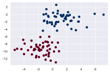
더미데이터 생성
from sklearn.datasets import make_blobs
X, y = make_blobs(100, 2, centers=2, random_state=2, cluster_std=1.5)
# 생성된 데이터의 시각화
plt.scatter(X[:, 0], X[:, 1], c=y, s=50, cmap='RdBu');
#훈련 데이터와 테스트데이터의 분리
train_x, test_x, train_y, test_y = train_test_split(X, y, test_size=0.2)

print(f'TRAINING   X : {train_x.shape} , Y : {train_y.shape}')
print(f'TESTING    X : {test_x.shape} , Y : {test_y.shape}')
TRAINING   X : (80, 2) , Y : (80,)
TESTING    X : (20, 2) , Y : (20,)
Q. Modeling
- Naive Bayes의 모델을 생성한 뒤 훈련데이터로 훈련을 시키시오.(hint:GaussianNB)
- 테스트데이터로 결과를 예측하고 해석하시오.(hint:classification_report)
from sklearn.naive_bayes import GaussianNB
model = GaussianNB() #모델생성
#코드를 작성해주세요.
fitted = model.fit(train_x, train_y)
y_pred = fitted.predict(test_x)
y_pred
array([1, 1, 1, 1, 1, 0, 0, 0, 0, 1, 1, 1, 1, 1, 0, 0, 0, 0, 0, 1])
test_y
array([1, 1, 1, 1, 1, 0, 0, 0, 0, 1, 1, 1, 1, 1, 0, 0, 0, 0, 0, 1])
rpt_result = classification_report(test_y, y_pred)
print('{}'.format(rpt_result))
              precision    recall  f1-score   support

           0       1.00      1.00      1.00         9
           1       1.00      1.00      1.00        11

    accuracy                           1.00        20
   macro avg       1.00      1.00      1.00        20
weighted avg       1.00      1.00      1.00        20
Precision(정밀도) = PPV(Positive Predictive Value), 이들은 같은 개념이다.
-> 모델이 True라고 분류한 것 중에서 실제 True인 것의 비율
Recall(재현율) = Sensitivity = hit rate, 이들은 같은 개념이다.
-> 실제 True인 것 중에서 모델이 True라고 예측한 것의 비율
F1 score
-> 정밀도와 재현율의 조화평균
-> 데이터 label이 불균형 구조일때, 모델의 성늘을 정확하게 평가할 수 있음 (하나의 숫자로 표현 가능)
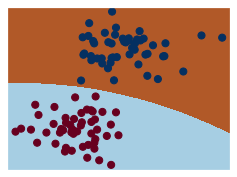
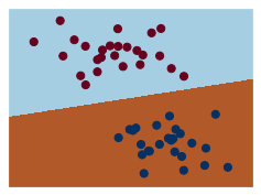
Q. Visualization
- 학습된 모델이 어떻게 경계를 나누고 있는지 확인을 하기위해 시각화를 하시오.(hint:matplotlib)
- 더미데이터 2000개를 만들고, 만들어진 데이터를 모델로 예측해서 배경으로 채우시오.(hint: np.random.RandomState, predict)
#코드를 작성해주세요.
#시각화 Method
def visualization(model, y):
    x_min, x_max = X[:, 0].min() - .5, X[:, 0].max() + .5
    y_min, y_max = X[:, 1].min() - .5, X[:, 1].max() + .5
    h = .02  # step size in the mesh
    xx, yy = np.meshgrid(np.arange(x_min, x_max, h), np.arange(y_min, y_max, h))
    Z = model.predict(np.c_[xx.ravel(), yy.ravel()])

    # Put the result into a color plot
    Z = Z.reshape(xx.shape)
    plt.figure(1, figsize=(4, 3))
    plt.pcolormesh(xx, yy, Z, cmap=plt.cm.Paired)

    # Plot also the training points
    # plt.scatter(X[:, 0], X[:, 1], c=y, edgecolors='k', cmap=plt.cm.Paired)
    plt.scatter(X[:, 0], X[:, 1], c=y, s=50, cmap='RdBu');

    plt.xlim(xx.min(), xx.max())
    plt.ylim(yy.min(), yy.max())
    plt.xticks(())
    plt.yticks(())

    plt.show()

visualization(model, y)
rng = np.random.RandomState(0)
random_number = rng.randn(2000).reshape(1000, 2)
random_number
array([[ 1.76405235,  0.40015721],
       [ 0.97873798,  2.2408932 ],
       [ 1.86755799, -0.97727788],
       ...,
       [ 0.19782817,  0.0977508 ],
       [ 1.40152342,  0.15843385],
       [-1.14190142, -1.31097037]])
y_pred_1 = fitted.predict(random_number)
k-NN
k-최근접 이웃 알고리즘(또는 줄여서 k-NN)은 분류나 회귀에 사용되는 비모수 방식이다.
import numpy as np
from sklearn.neighbors import KNeighborsClassifier
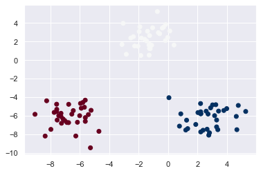
더미데이터 생성
X, y = make_blobs(n_features=2, centers=3)
# 생성된 데이터의 시각화
plt.scatter(X[:, 0], X[:, 1], c=y, cmap='RdBu')
<matplotlib.collections.PathCollection at 0x11ac532e148>
#훈련 데이터와 테스트데이터의 분리
train_x, test_x, train_y, test_y = train_test_split(X, y, test_size=0.2)

print(f'TRAINING   X : {train_x.shape} , Y : {train_y.shape}')
print(f'TESTING    X : {test_x.shape} , Y : {test_y.shape}')
TRAINING   X : (80, 2) , Y : (80,)
TESTING    X : (20, 2) , Y : (20,)
Q. Modeling
- k-NN 모델을 생성한 뒤 훈련데이터로 훈련을 시키시오.(hint:KNeighborsClassifier)
- 테스트데이터로 결과를 예측하고 해석하시오.(hint:classification_report)
model2 = KNeighborsClassifier()
#코드를 작성해주세요.
fitted2 = model2.fit(train_x, train_y)
y_pred2 = fitted2.predict(test_x)
y_pred2
array([1, 2, 1, 1, 1, 0, 1, 1, 0, 1, 1, 2, 0, 1, 2, 1, 2, 1, 1, 2])
test_y
array([1, 2, 1, 1, 1, 0, 1, 1, 0, 1, 1, 2, 0, 1, 2, 1, 2, 1, 1, 2])
rpt_result2 = classification_report(test_y, y_pred2)
print('{}'.format(rpt_result2))
              precision    recall  f1-score   support

           0       1.00      1.00      1.00         3
           1       1.00      1.00      1.00        12
           2       1.00      1.00      1.00         5

    accuracy                           1.00        20
   macro avg       1.00      1.00      1.00        20
weighted avg       1.00      1.00      1.00        20
Q. Visualization
- 학습된 모델이 어떻게 경계를 나누고 있는지 확인을 하기위해 시각화를 하시오.(hint:matplotlib)
#코드를 작성해주세요.
visualization(model2, y)
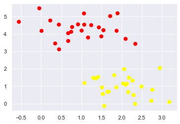
Support Vector Machine
두 카테고리 중 어느 하나에 속한 데이터의 집합이 주어졌을 때, Support Vector Machine(이하 SVM) 알고리즘은 주어진 데이터 집합을 바탕으로 하여 새로운 데이터가 어느 카테고리에 속할지 판단하는 비확률적 이진 선형 분류 모델을 만든다.
더미데이터의 생성
from sklearn.datasets.samples_generator import make_blobs
X, y = make_blobs(n_samples=50, centers=2, random_state=0, cluster_std=0.60)
# 생성된 데이터의 시각화
plt.scatter(X[:, 0], X[:, 1], c=y, s=50, cmap='autumn')
<matplotlib.collections.PathCollection at 0x11ac52ef388>
#훈련 데이터와 테스트데이터의 분리
train_x, test_x, train_y, test_y = train_test_split(X, y, test_size=0.2)

print(f'TRAINING   X : {train_x.shape} , Y : {train_y.shape}')
print(f'TESTING    X : {test_x.shape} , Y : {test_y.shape}')
TRAINING   X : (40, 2) , Y : (40,)
TESTING    X : (10, 2) , Y : (10,)
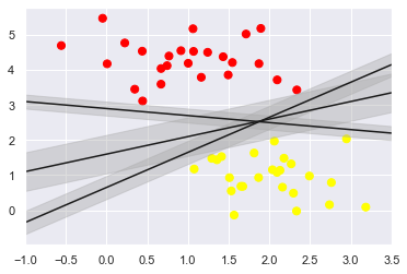
두개의 점을 하나의 직선으로 나누고자 할때 아래 그림과 같이 여러 방법이 있을 것이다.
SVM 알고리즘은 두개의 Class의 간격을 최고로 많이 벌린 간격(Margin)을 구한다.
이때 매우 엄격하게 두 개의 class를 분리하는 것을 HardMarin이라하고 좀더 유연하게 분리하는 것을 SoftMargin이라 한다.
xfit = np.linspace(-1, 3.5)

plt.scatter(X[:, 0], X[:, 1], c=y, s=50, cmap='autumn')

for m, b, d in [(1, 0.65, 0.33), (0.5, 1.6, 0.55), (-0.2, 2.9, 0.2)]:
    yfit = m * xfit + b
    plt.plot(xfit, yfit, '-k')
    plt.fill_between(xfit, yfit-d, yfit + d,
                     edgecolor='none',
                     color='#AAAAAA',
                     alpha=0.4)

plt.xlim(-1, 3.5)
(-1.0, 3.5)
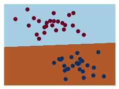
Q. Modeling
- k-NN 모델을 생성한 뒤 훈련데이터로 훈련을 시키시오.(hint:SVC)
- 테스트데이터로 결과를 예측하고 해석하시오.(hint:classification_report)
from sklearn.svm import SVC

model3 = SVC(kernel='linear', C=1E10)
#코드를 작성해주세요.
fitted3 = model3.fit(train_x, train_y)
y_pred3 = fitted3.predict(test_x)
y_pred3
array([0, 1, 0, 1, 1, 0, 0, 0, 0, 0])
test_y
array([0, 1, 0, 1, 1, 0, 0, 0, 0, 0])
rpt_result3 = classification_report(test_y, y_pred3)
print('{}'.format(rpt_result3))
              precision    recall  f1-score   support

           0       1.00      1.00      1.00         7
           1       1.00      1.00      1.00         3

    accuracy                           1.00        10
   macro avg       1.00      1.00      1.00        10
weighted avg       1.00      1.00      1.00        10
Q. Visualization
- 학습된 모델이 어떻게 경계를 나누고 있는지 확인을 하기위해 시작화를 하시오.(hint:matplotlib)
- HardMargin과 SoftMargin을 확인하기 위해 매개변수 C의 값을 10과 0.1로 주어 모델을 훈련시키고 시각화를 하시오.
#코드를 작성해주세요.
visualization(model3, y)

model3_B = SVC(kernel='linear', C=10.0)
fitted3_B = model3_B.fit(train_x, train_y)
y_pred3_B = fitted3_B.predict(test_x)
visualization(model3_B, y)
model3_C = SVC(kernel='linear', C=0.1)
fitted3_C = model3_C.fit(train_x, train_y)
y_pred3_C = fitted3_C.predict(test_x)
visualization(model3_C, y)
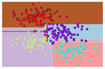
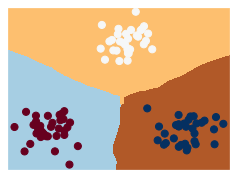
DecisionTree
결정 트리 학습법(decision tree learning)은 어떤 항목에 대한 관측값과 목표값을 연결시켜주는 예측 모델로써 결정 트리를 사용한다.
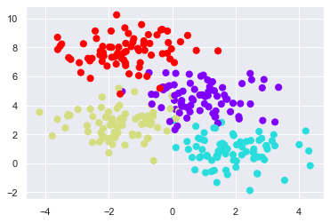
더미데이터의 생성
X, y = make_blobs(n_samples=300, centers=4, random_state=0, cluster_std=1.0)
# 생성된 데이터의 시각화
plt.scatter(X[:, 0], X[:, 1], c=y, s=50, cmap='rainbow')
<matplotlib.collections.PathCollection at 0x11ac60b3508>
#훈련 데이터와 테스트데이터의 분리
train_x, test_x, train_y, test_y = train_test_split(X, y, test_size=0.2)

print(f'TRAINING   X : {train_x.shape} , Y : {train_y.shape}')
print(f'TESTING    X : {test_x.shape} , Y : {test_y.shape}')
TRAINING   X : (240, 2) , Y : (240,)
TESTING    X : (60, 2) , Y : (60,)
Q. Modeling
- k-NN 모델을 생성한 뒤 훈련데이터로 훈련을 시키시오.(hint:DecisionTreeClassifier)
- 테스트데이터로 결과를 예측하고 해석하시오.(hint:classification_report)
from sklearn.tree import DecisionTreeClassifier
model4 = DecisionTreeClassifier()
#코드를 작성해주세요.
model4.fit(train_x, train_y)
y_pred4 = model4.predict(test_x)
rpt_result4 = classification_report(test_y, y_pred4)
print('{}'.format(rpt_result4))
              precision    recall  f1-score   support

           0       0.86      0.80      0.83        15
           1       0.85      1.00      0.92        11
           2       0.95      0.95      0.95        19
           3       1.00      0.93      0.97        15

    accuracy                           0.92        60
   macro avg       0.91      0.92      0.91        60
weighted avg       0.92      0.92      0.92        60
Q. Visualization
- 학습된 모델이 어떻게 경계를 나누고 있는지 확인을 하기위해 시작화를 하시오.(hint:matplotlib)
ax = plt.gca()
ax.scatter(X[:, 0], X[:, 1], c=y, s=30, cmap='rainbow',
           clim=(y.min(), y.max()), zorder=3)
ax.axis('tight')
ax.axis('off')

#코드를 작성해주세요.
visualization(model4, y)